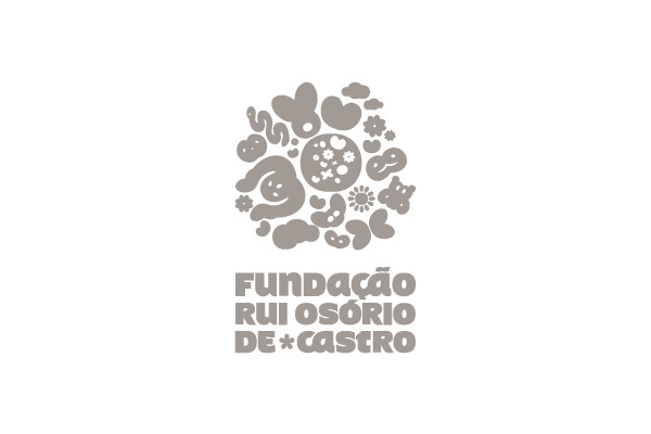
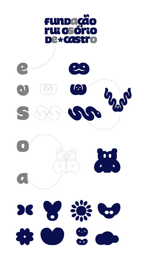
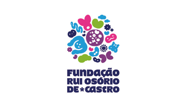
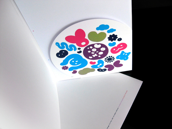
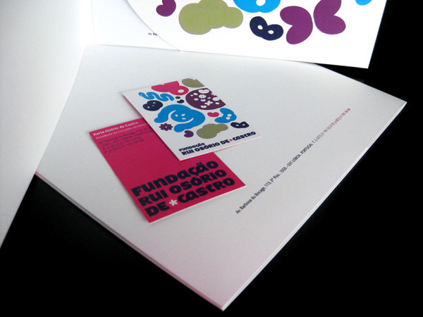
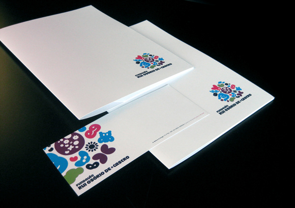

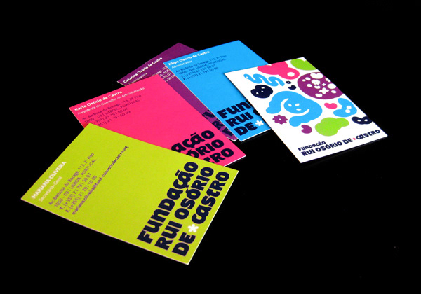
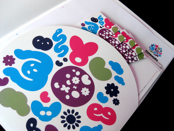
The Osório de Castro Foundation was born to support families of cancer children in terminal stage. It’s dedicated to divulging information about the disease and to palliative care. The brief asked for a brand identity that expressed several values simultaneous: protection, support, positivity with a child like nature without losing its credibility. Creative Solution The solution was found at the foundation name itself and within the chosen typeface. We manipulated the letters in order to create symbols from children imaginary, organized in a World like shape. The Osório de Castro Foundation thus appears like a world apart, where children can find help from people that truly understand them.